SPECIFICATIONS
Brand Name: NoEnName_Null
Hign-concerned Chemical: None
Product Description
.aplus-v2 .container-with-background-image {
width: 100%;
height: 100%;
background-repeat: no-repeat;
background-size: cover;
}


Specifications
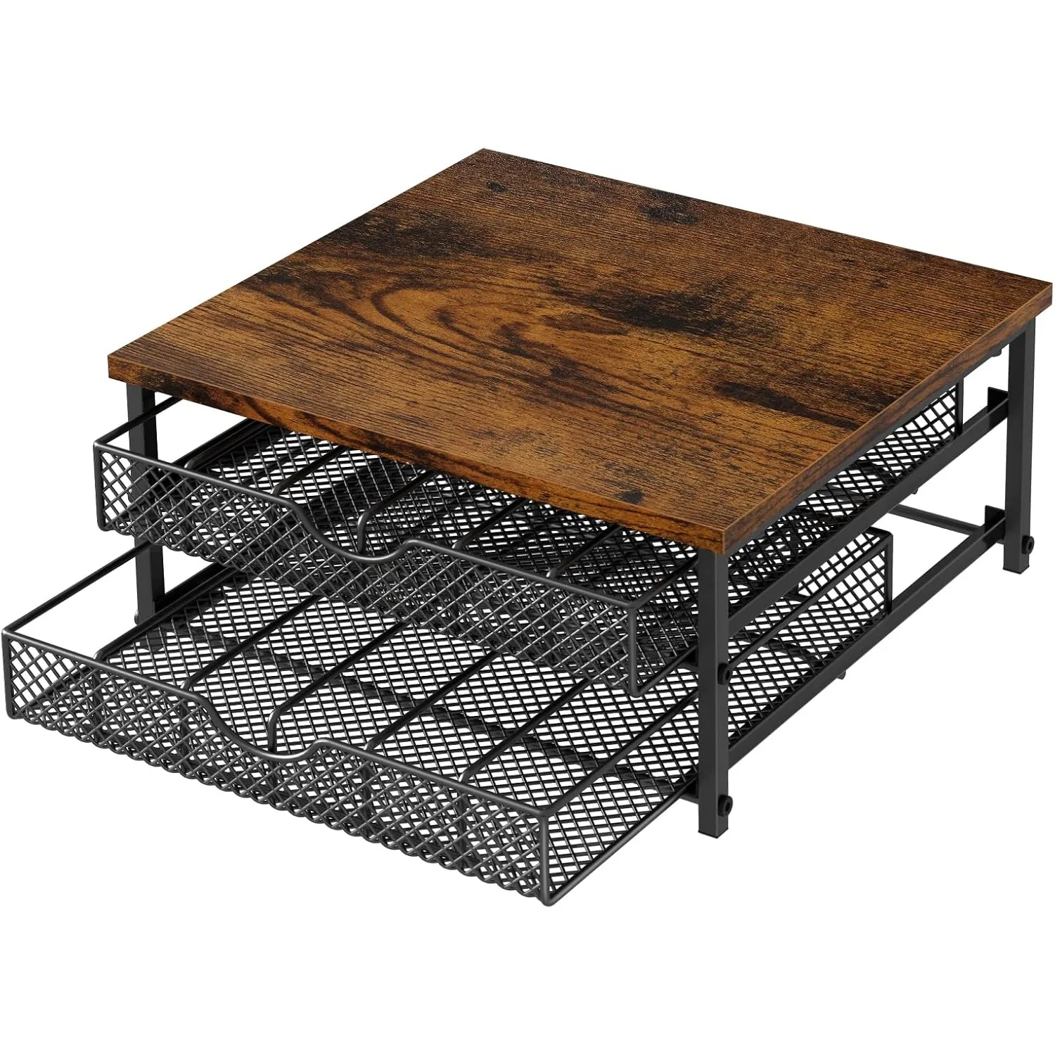
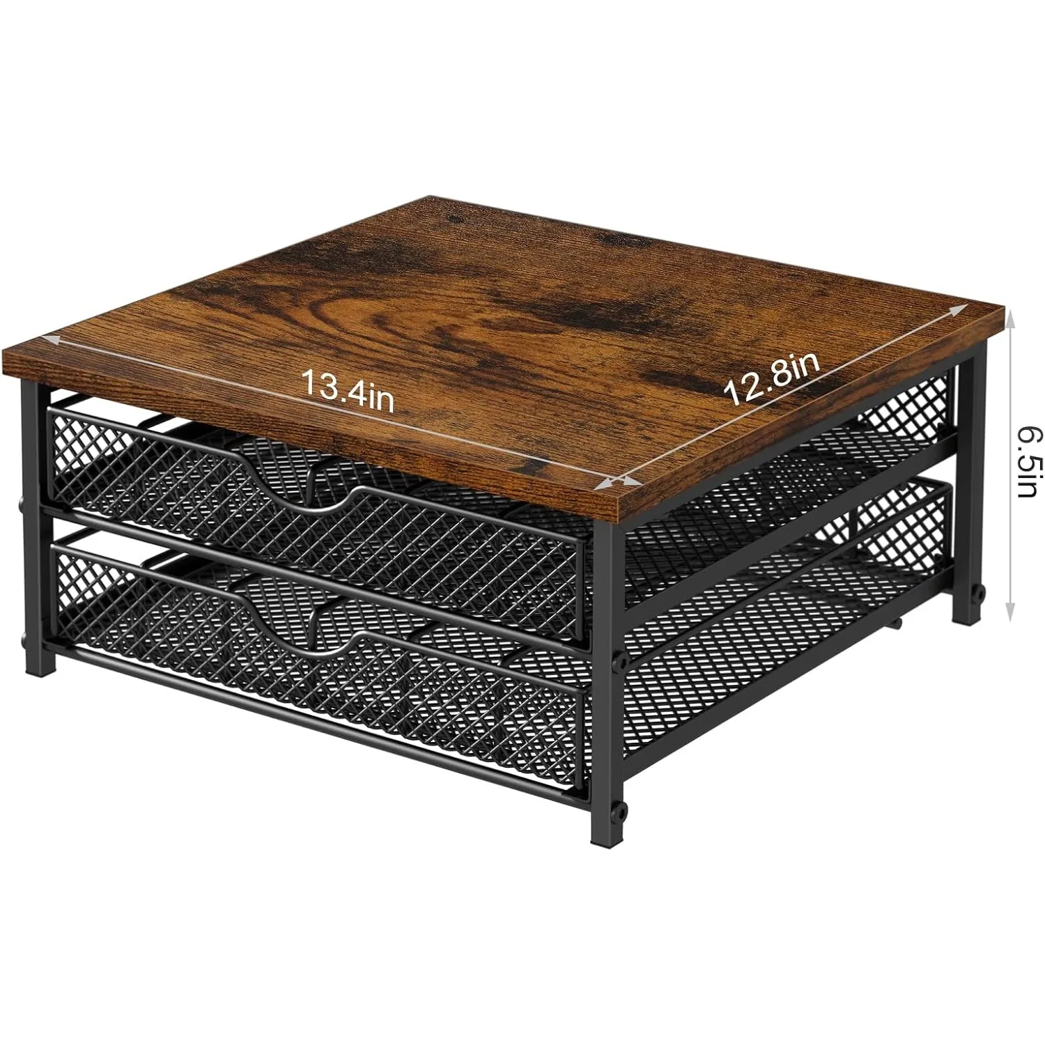
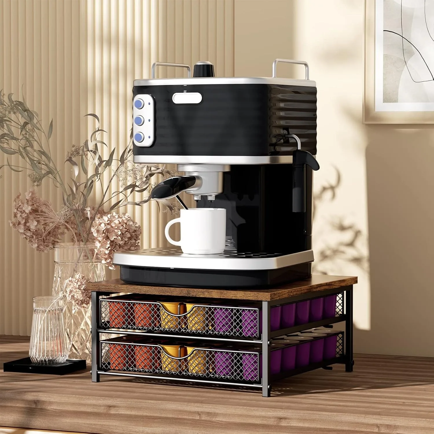
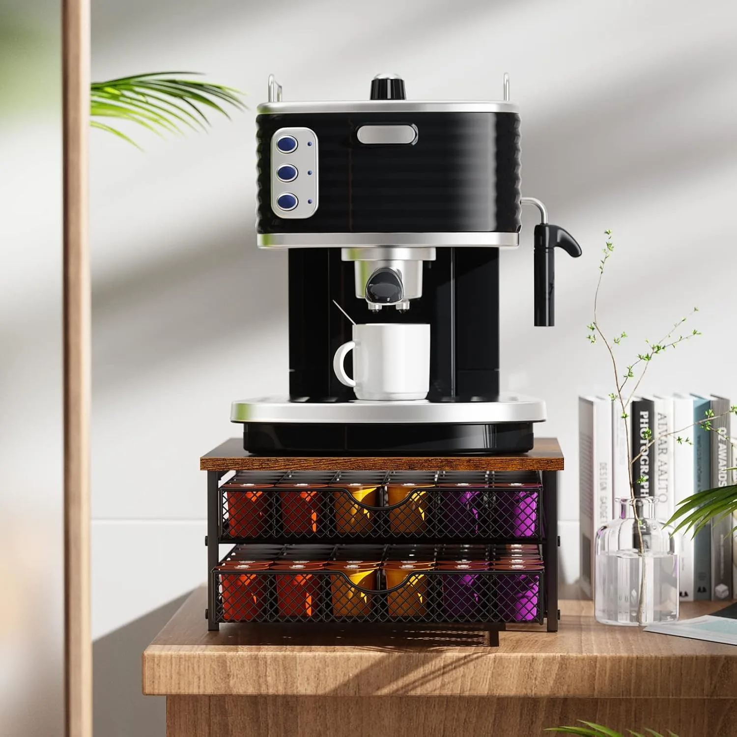
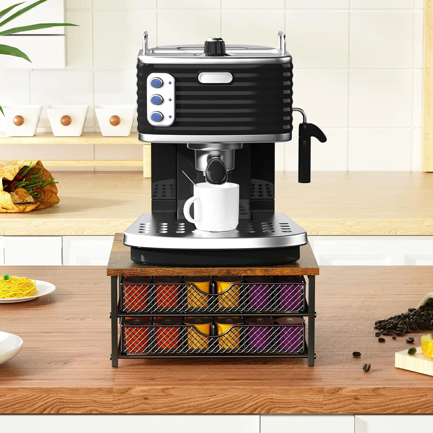
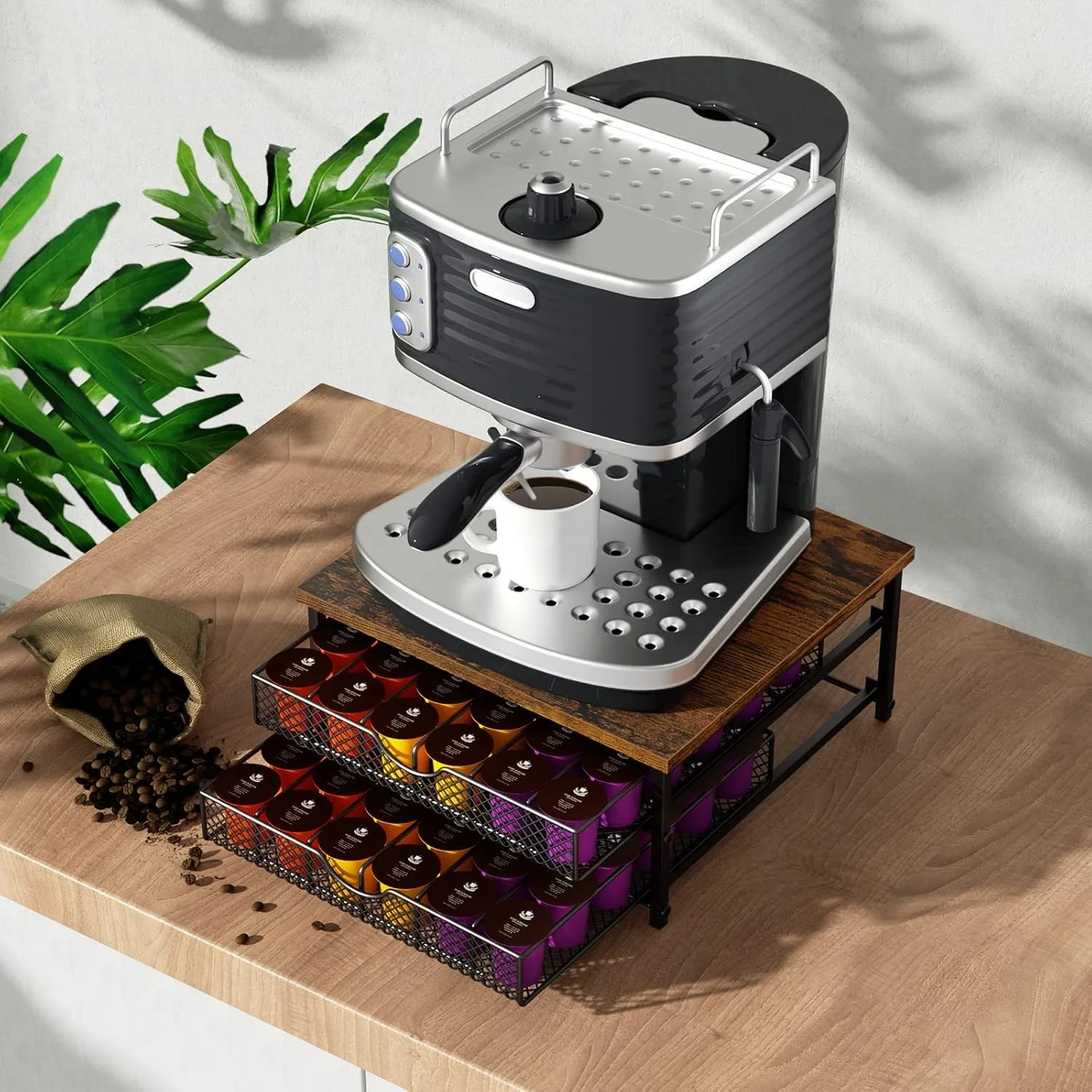
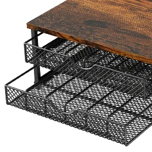
Material: Metal, MDF Wood
Color: Black, Brown
Style: Modern/Rustic
Size: 13.4”L x 12.8”W x 6.5”H
Capacity: 72 Pods
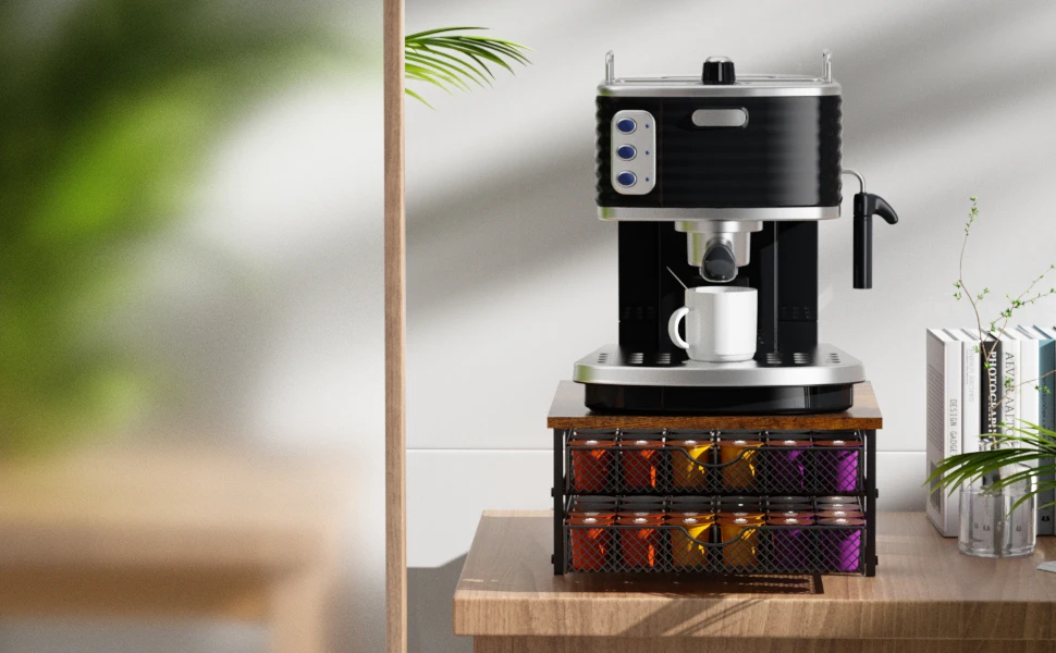
Large Capacity–Meet your needs and find a new home for your K-cups. Find the flavors you need in an organized arrangement!
Easy To Clean–The drawer and board can be wiped effortlessly with a cloth or paper towel, and the ventilated designed basket keeps the coffee pods dry.
With Stopper Design
Sliding drawers with stoppers are easy to pull out and prevent you from falling on the floor when fully open, so you don’t have to worry about sliding them all out.
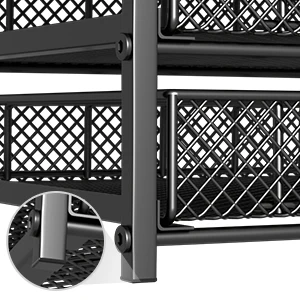
Anti-slip Design
The coffee pod storage with rubber foot pads can be stored anywhere to move around and avoid scratching your desk.

Metal Mesh Design
The mesh design keeps your pods visible, keeps your k cups organizer ventilated and dry, and is easy to clean.
.aplus-v2 .aplus-review-right-padding {
padding-right: 0.1rem;
}
.aplus-v2 .aplus-review-right-padding {
padding-right: 0.1rem;
}
.aplus-v2 .aplus-review-right-padding {
padding-right: 0.1rem;
}
.aplus-v2 .aplus-review-right-padding {
padding-right: 0.1rem;
}
.aplus-v2 .aplus-review-right-padding {
padding-right: 0.1rem;
}
.aplus-v2 .aplus-review-right-padding {
padding-right: 0.1rem;
}
.aplus-v2 .container-with-background-image {
width: 100%;
height: 100%;
background-repeat: no-repeat;
background-size: cover;
}
.aplus-v2 .apm-brand-story-carousel-container {
position: relative;
}
.aplus-v2 .apm-brand-story-carousel-hero-container,
.aplus-v2 .apm-brand-story-carousel-hero-container > div {
position: absolute;
width: 100%;
}
/*
Ensuring the carousel takes only the space it needs.
The sizes need to be set again on the absolutely positioned elements so they can take up space.
*/
.aplus-v2 .apm-brand-story-carousel-container,
.aplus-v2 .apm-brand-story-carousel-hero-container {
height: 625px;
width: 100%;
max-width: 1464px;
margin-left: auto;
margin-right: auto;
overflow: hidden;
}
.aplus-v2 .apm-brand-story-carousel-hero-container,
.aplus-v2 .apm-brand-story-carousel-hero-container > div {
height: 625px;
}
.aplus-v2 .apm-brand-story-carousel.a-carousel-container {
padding: 0px;
}
/*
This centers the carousel vertically on top of the hero image container and after the logo area (125px).
Margin-top = (heroHeight – cardHeight – logoAreaHeight) / 2 + logoAreaHeight
*/
.aplus-v2 .apm-brand-story-carousel .a-carousel-row-inner {
margin-top: 149px;
}
/*
Cards need to have a width set, otherwise they default to 50px or so.
All cards must have the same width. The carousel will resize itself so all cards take the width of the largest card.
The left margin is for leaving a space between each card.
*/
.aplus-v2 .apm-brand-story-carousel .a-carousel-card {
width: 362px;
margin-left: 30px !important;
}
/* styling the navigation buttons so they are taller, flush with the sides, and have a clean white background */
.aplus-v2 .apm-brand-story-carousel .a-carousel-col.a-carousel-left,
.aplus-v2 .apm-brand-story-carousel .a-carousel-col.a-carousel-right {
padding: 0px;
}
.aplus-v2 .apm-brand-story-carousel .a-carousel-col.a-carousel-left .a-button-image,
.aplus-v2 .apm-brand-story-carousel .a-carousel-col.a-carousel-right .a-button-image {
border: none;
margin: 0px;
}
.aplus-v2 .apm-brand-story-carousel .a-carousel-col.a-carousel-left .a-button-image .a-button-inner,
.aplus-v2 .apm-brand-story-carousel .a-carousel-col.a-carousel-right .a-button-image .a-button-inner {
background: #fff;
padding: 20px 6px;
}
.aplus-v2 .apm-brand-story-carousel .a-carousel-col.a-carousel-left .a-button-image .a-button-inner {
border-radius: 0px 4px 4px 0px;
}
.aplus-v2 .apm-brand-story-carousel .a-carousel-col.a-carousel-right .a-button-image .a-button-inner {
border-radius: 4px 0px 0px 4px;
}